Composing With Glyphs
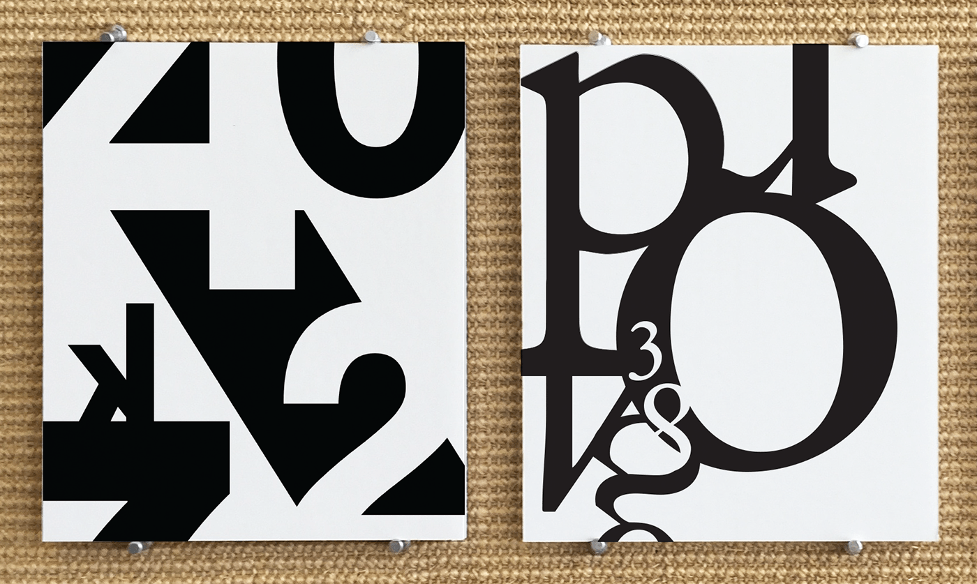
Left is the sans serif font- Neue Haas Grotesk.
Right is the serif font- Stempel Garamond.
These are final compositions for a project called "Composing with Glyphs." The main idea of the project is to use numbers and letters from two fonts and create an artistic representation. The compositions should reflect the personality of the fonts. The first font is a sans serif font called Neue Haas Grotesk and the second font is a serif font called Stempel Garamond. The other specification was that there could only be one usage of each lettering and only 5-8 letters can be used. Only black and white were to be used and there had to be two black glyphs and two white glyphs. Typography anatomy was used to precisely place each glyph. For example, stem and stroke were used as the thicker points throughout the compositions while bowl and spine were used to create more fragile and delicate areas throughout. Each glyph was placed with intent to add character, perspective and balance to the entirety of the compositions.

Neue Haas Grotesk Composition

Stempel Garamond Composition
